The project is built from that premise. Not as a store, but as a space where the product—colorful, diverse, almost graphic—becomes the true protagonist. The architecture, consequently, recedes. It becomes a support. Silence.
The starting point is not formal, it's perceptual:
How to design a space that doesn't compete with the product, but intensifies it?
The response materializes in a contained, almost introspective atmosphere, which deliberately contrasts with the visual energy of the packaging and the vibrant nature of the food.
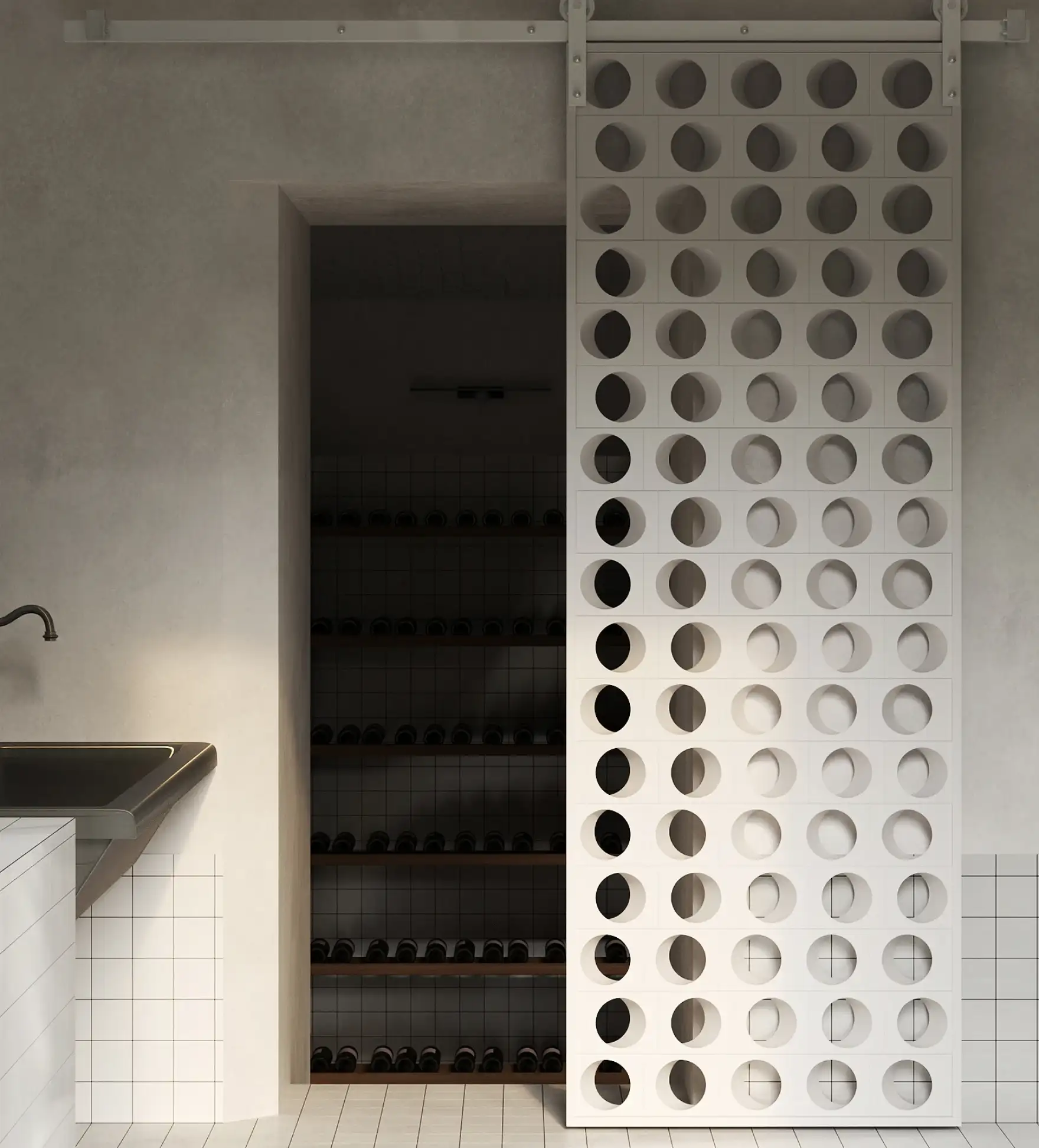
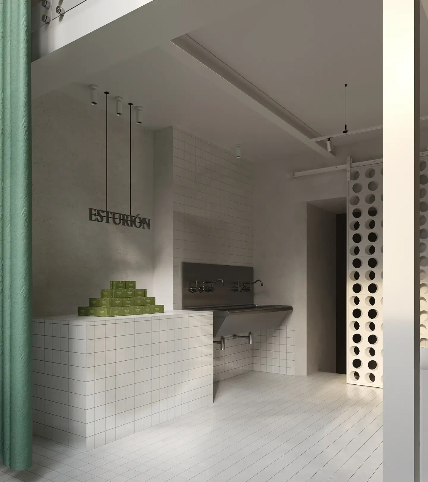
The atelier is conceived as a gallery.
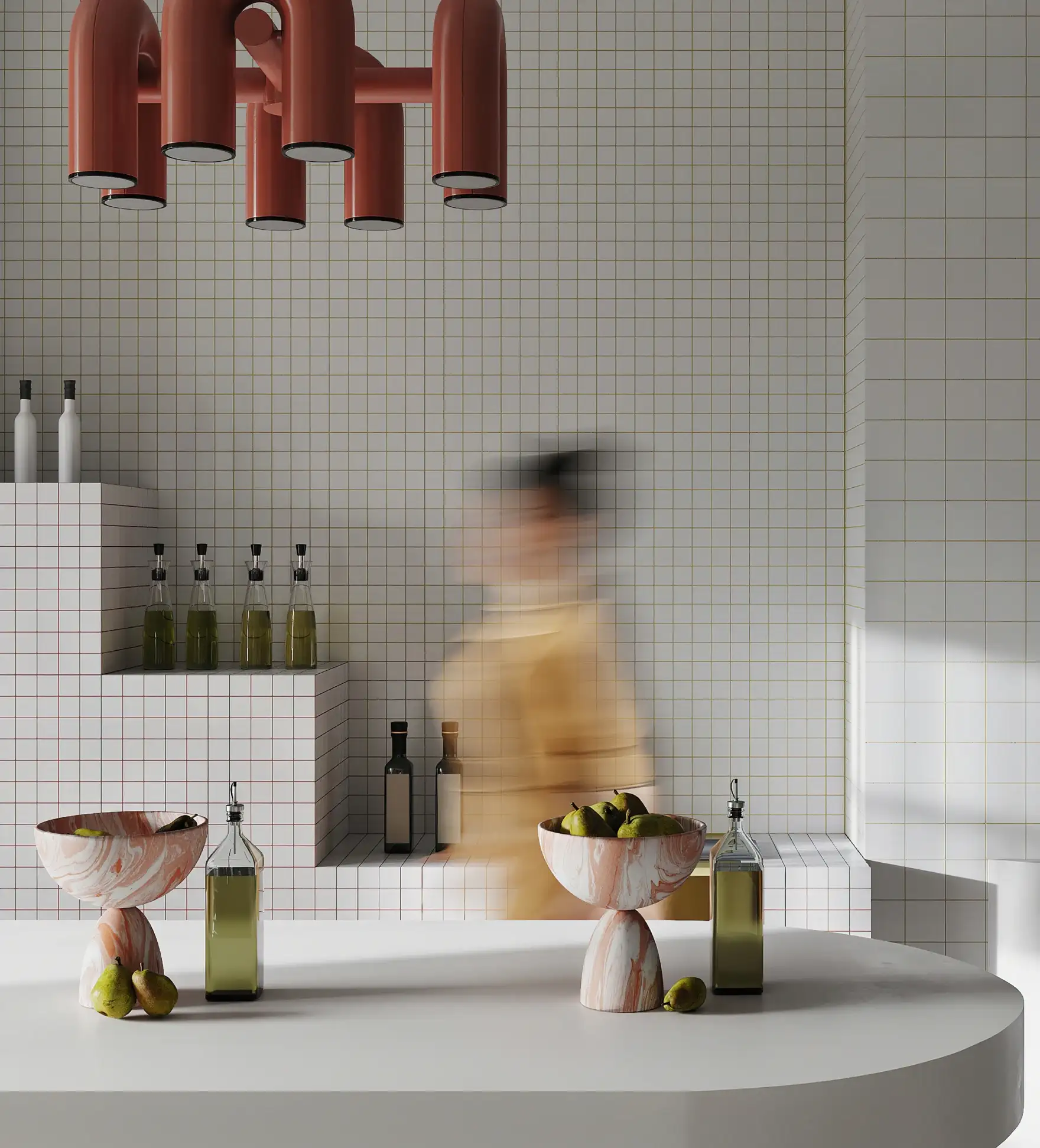
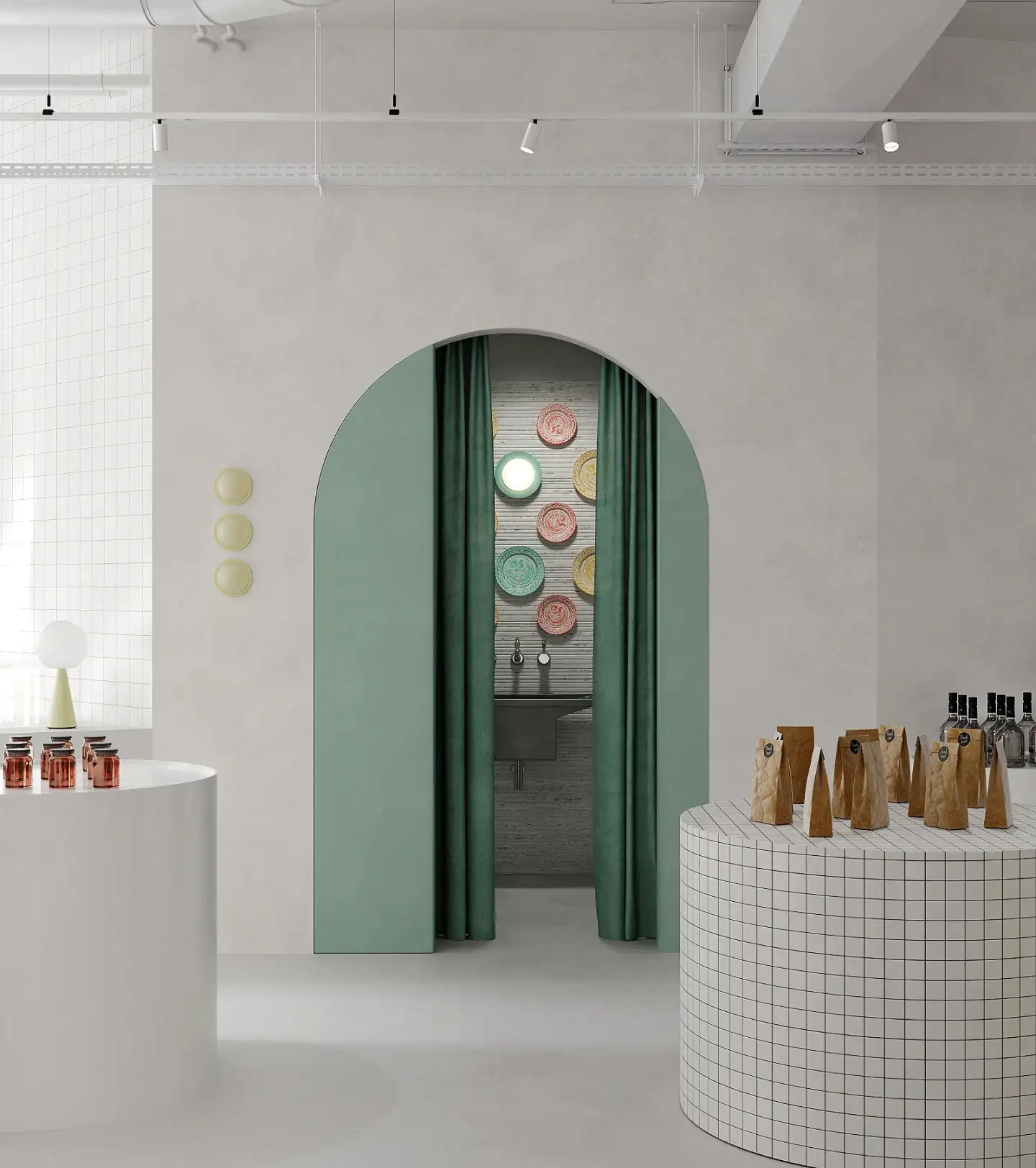
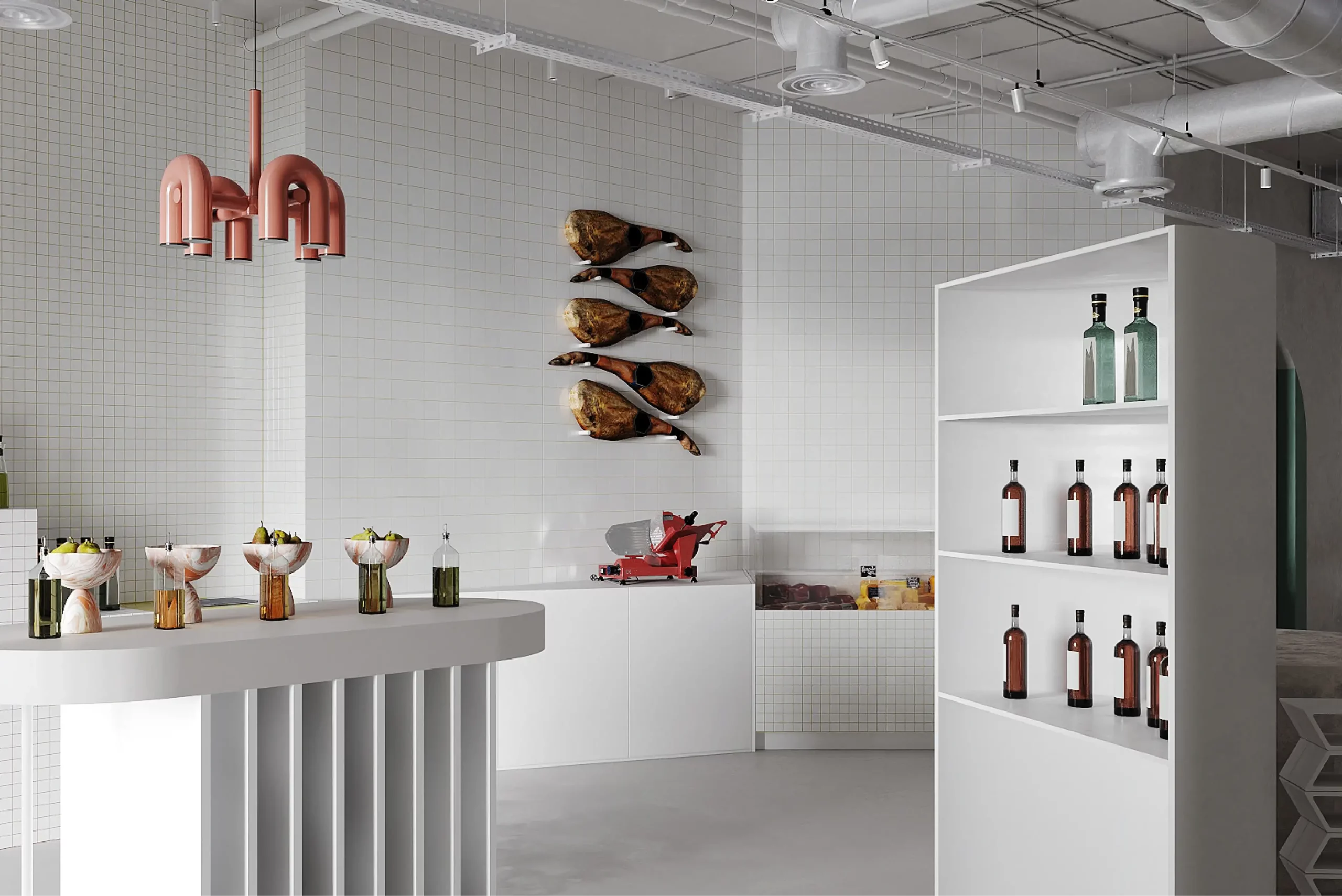
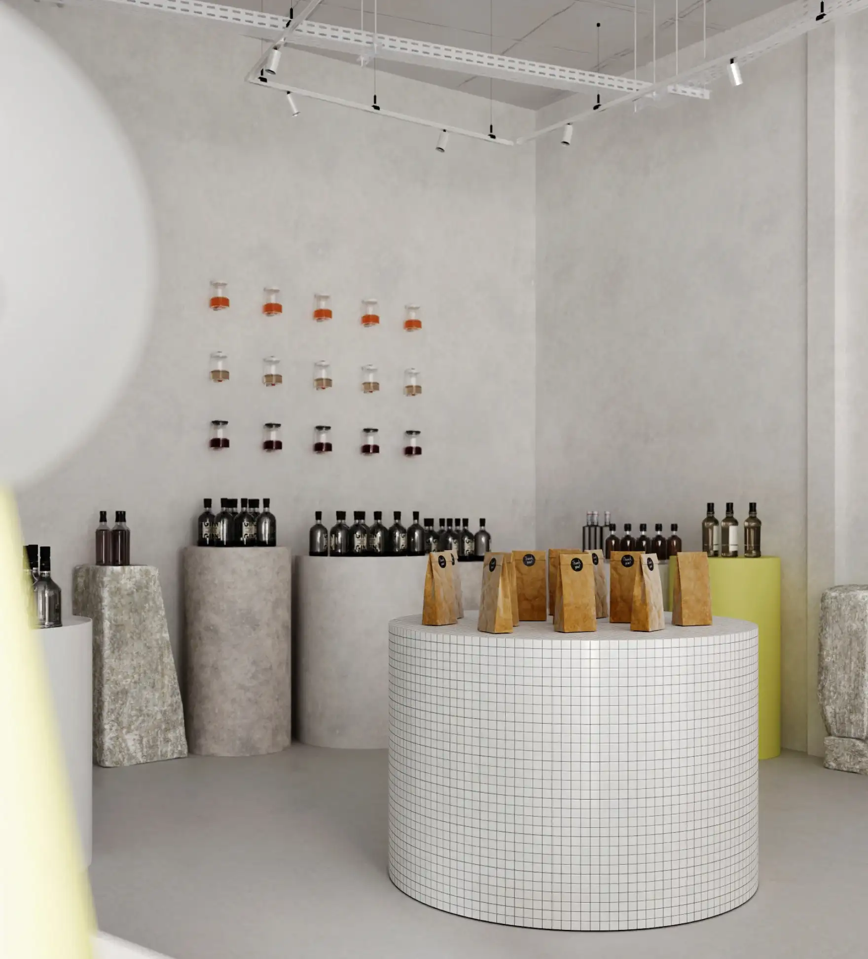
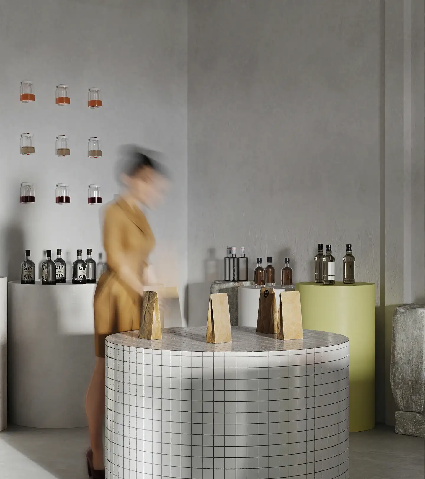
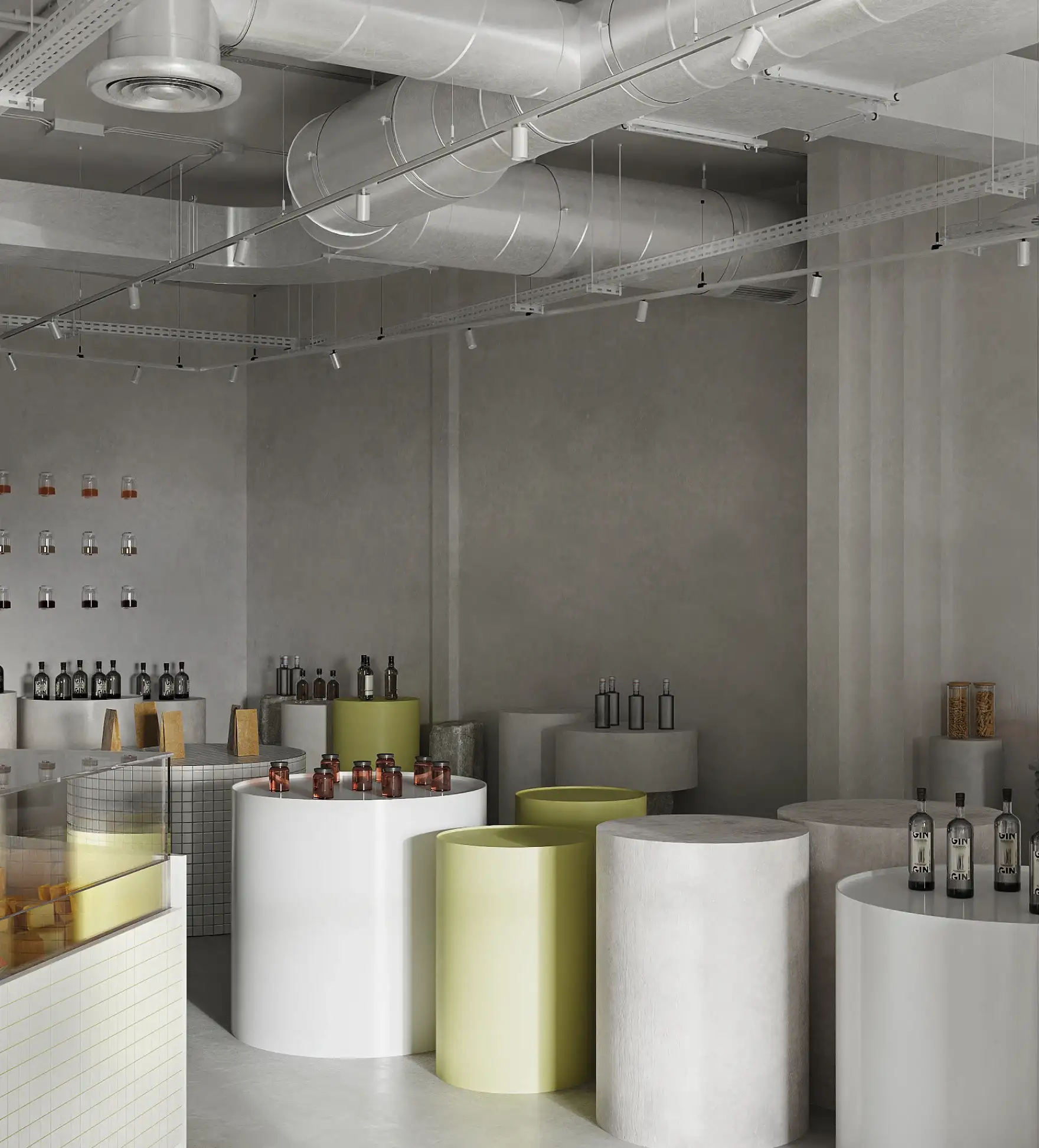
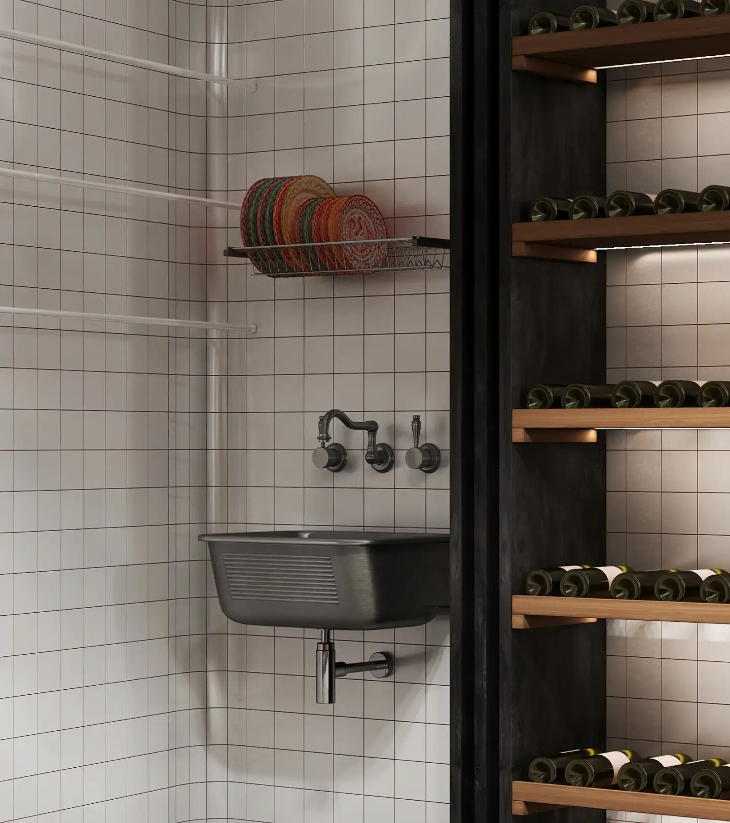
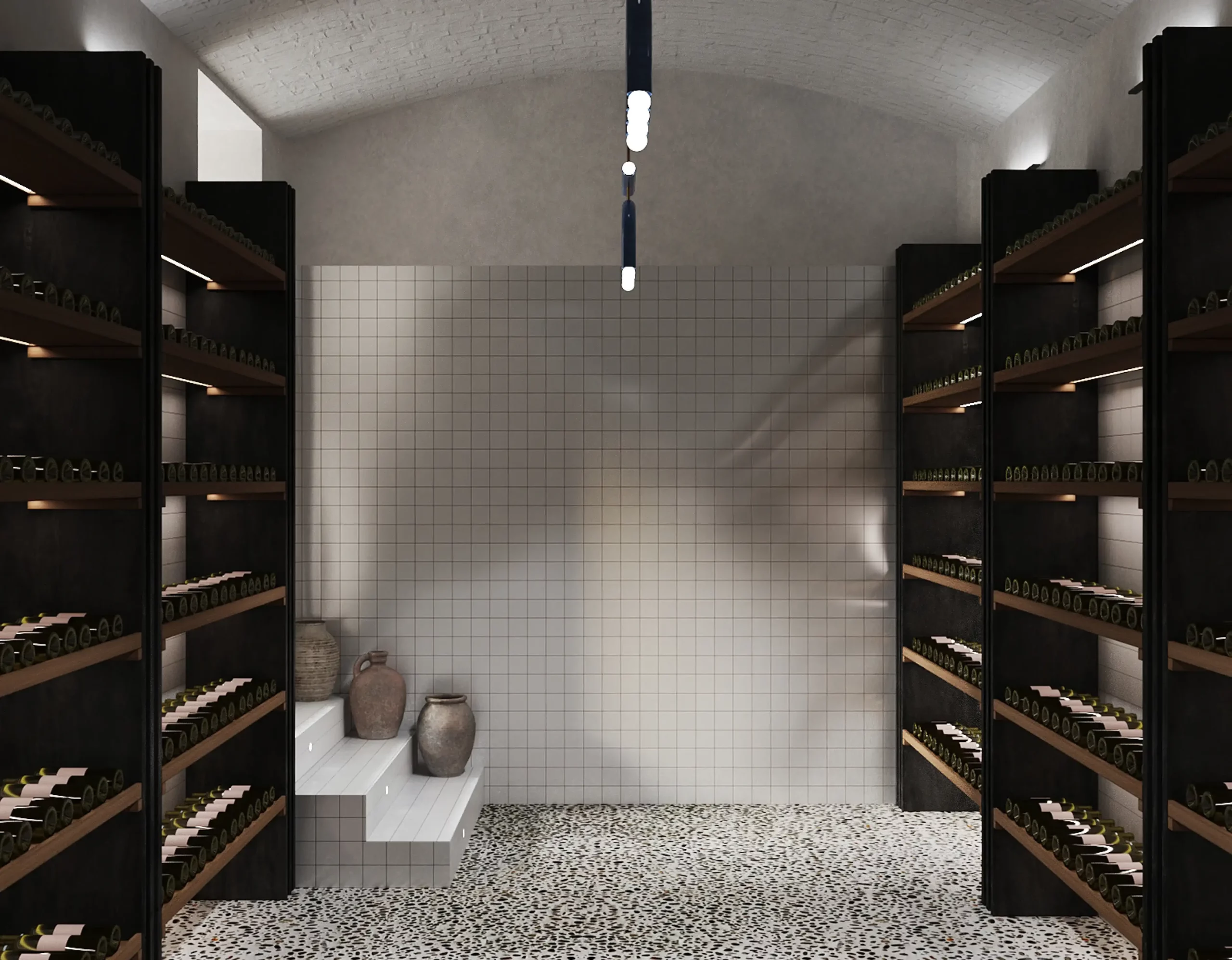
The walls, clad in white tiles and treated with unpigmented lime, function as a neutral, continuous background where light reflects softly. The floor—a resin applied artisanally—introduces a more fluid, almost silent quality, unifying the space and distancing it from the strictly commercial.
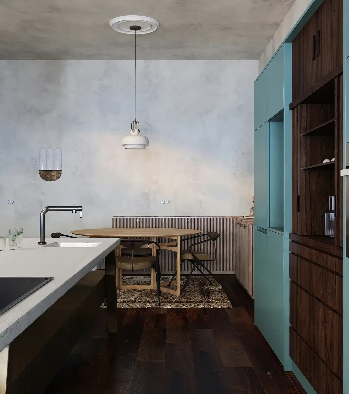
The palette is intentionally restrained: whites, soft yellows, washed teal greens.
It's not an aesthetic decision.
It's a perception strategy.
These tones allow the product to stand out without interference, while generating a sense of calm that invites you to stop, observe, and choose from a different perspective.
Materiality reinforces this balance.
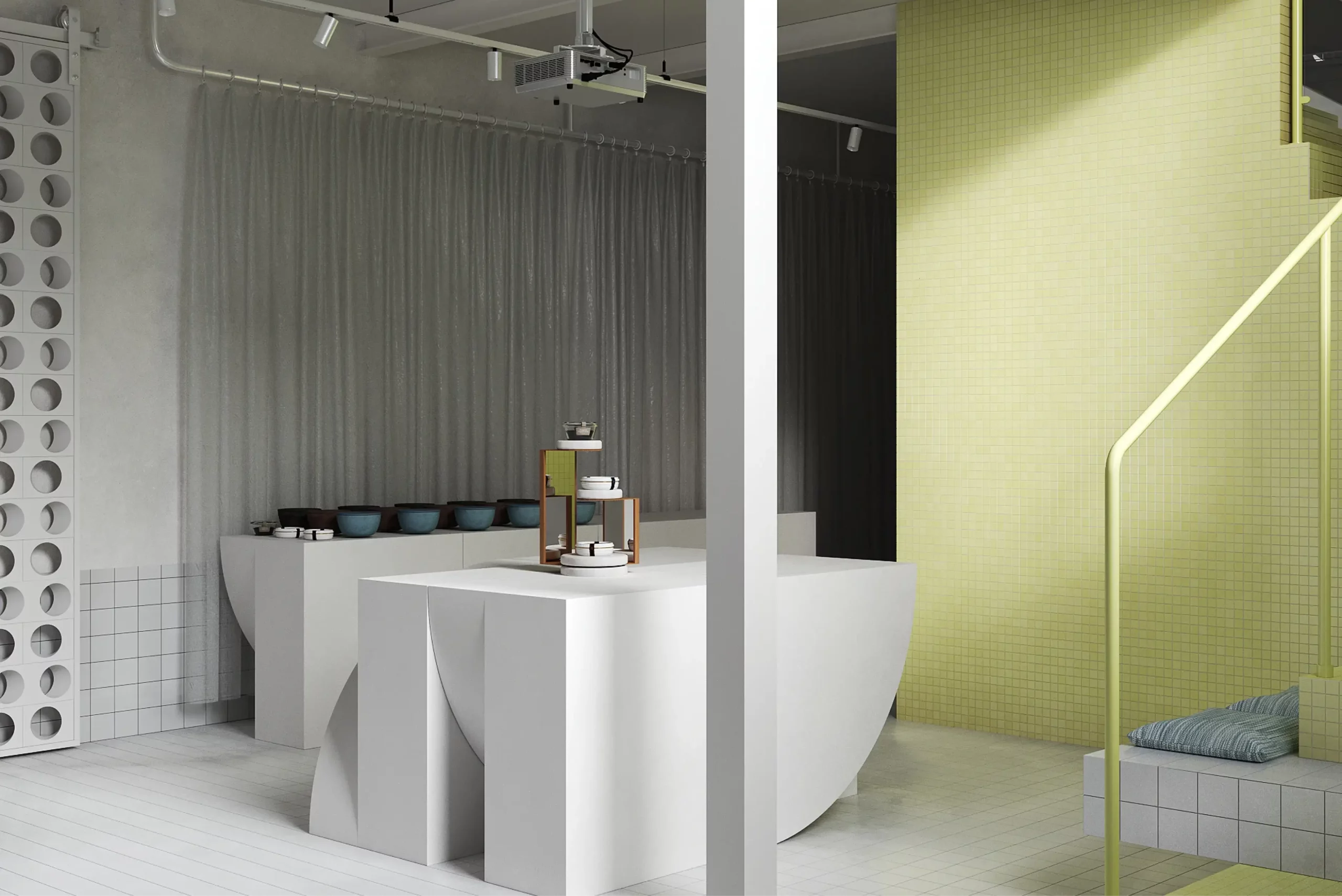
Mosaics, stone, and lacquered metal coexist in a precise composition where each element is calibrated not to stand out. The architecture doesn't seek to be the focus, but it doesn't disappear either; it supports.
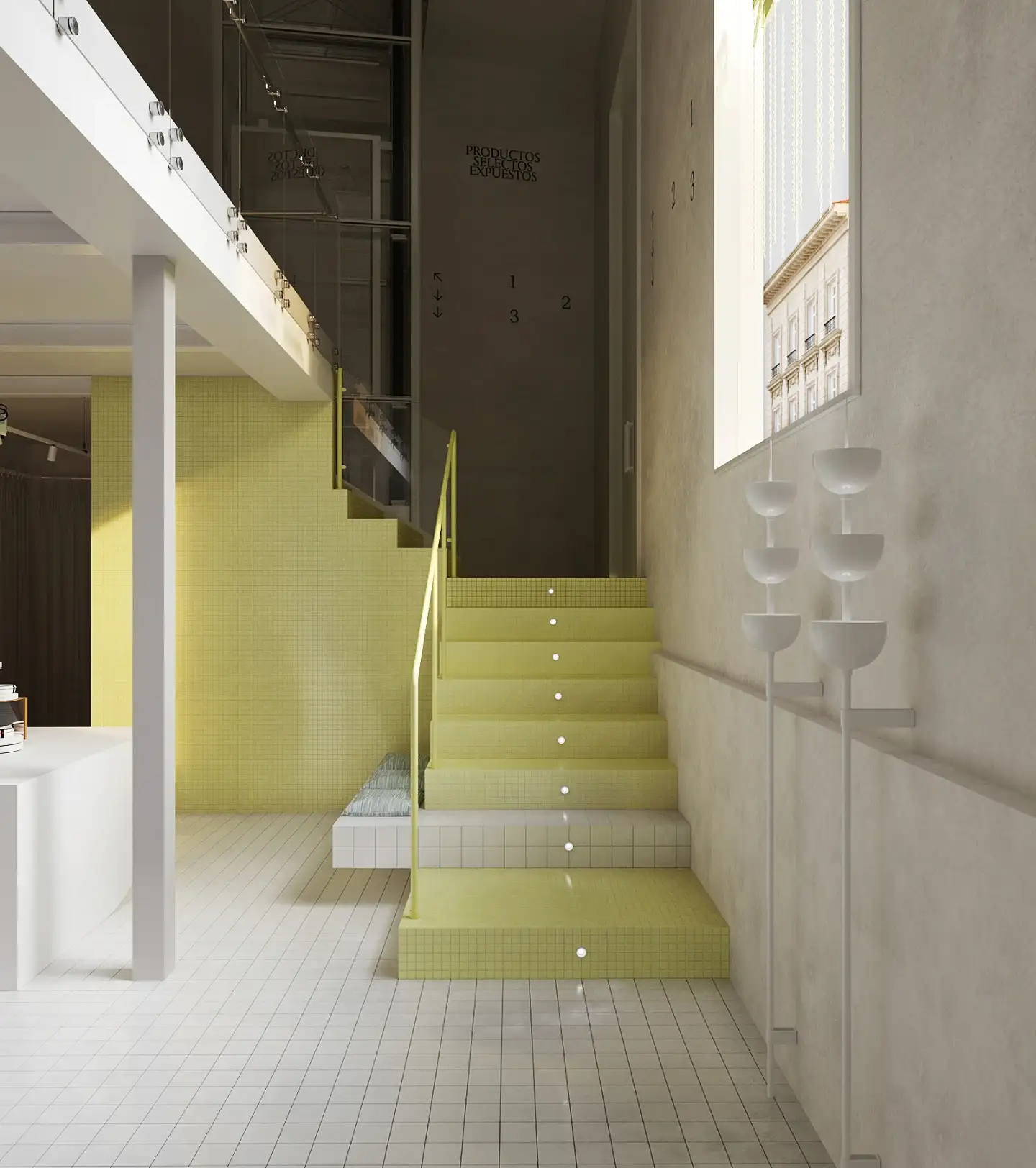
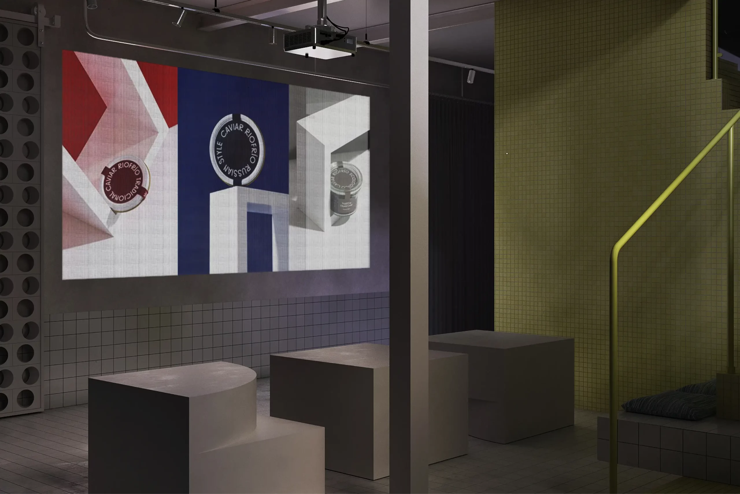
The industrial ceiling, with visible installations, introduces a layer of controlled rawness that connects with Granada's urban context. Contrasting this, the lighting—handled with an almost exhibition-like sensibility—constructs scenes, frames views, and directs the experience.
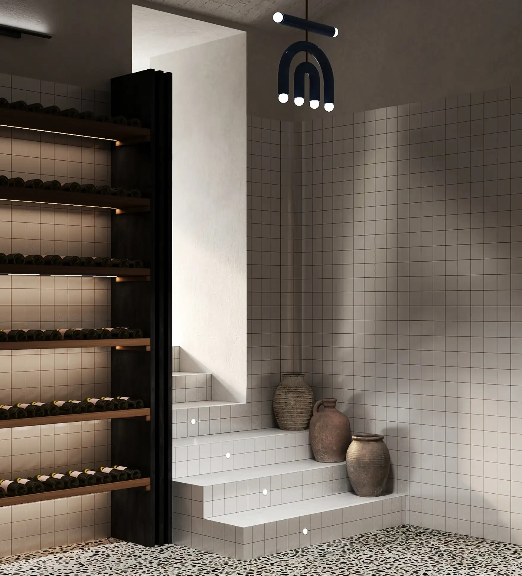
Space is not traveled.,
it is experimented in sequence.
Platforms, level changes, and sculptural pieces create a fluid choreography that invites movement, much like in an exhibition. Each vantage point offers a distinct reading of the product, as if each piece were a work of art.
The custom-designed furniture follows this logic.
It's not decoration, it's installation.
Elements that function as support, surface, and gesture at the same time.
The tables, the support pieces, even the layouts, are designed to activate interaction, but from a place of calm. Without noise. Without saturation.
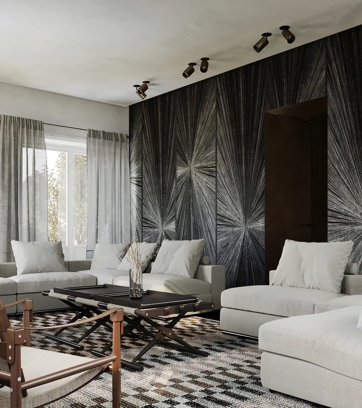
Color accents appear sporadically.
More intense yellows, coppery reflections in the luminaries, small gestures that don't decorate, but rather organize the gaze. They are compositional decisions that structure the space and reinforce the reading of the whole.
In Altelier, architecture does not define space.
It is defined by the relationship between product, light, and matter.
From Puntofilipino's perspective, the project is built on a clear logic: reduce to intensify. Eliminate the superfluous to allow the experience to emerge more clearly.
Altelier is not a gourmet shop.
It is a device where food is perceived as an object.,
where buying becomes observing,
and where every gesture—looking, choosing, trying on—acquires an almost ritual dimension.
A space where the everyday is elevated,
without artifice.